flex弹性布局
.container{ display:flex; flex-direction:row/column/row-reverse/column-reverse; .....}
容器属性:
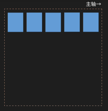
1.定义主轴方向:flex-direction
row(默认 水平)
column(垂直)
row-reverse(水平反方向)
column-reverse(垂直反方向)
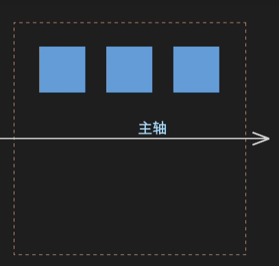
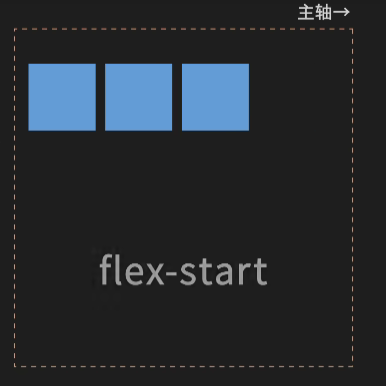
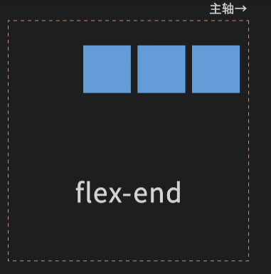
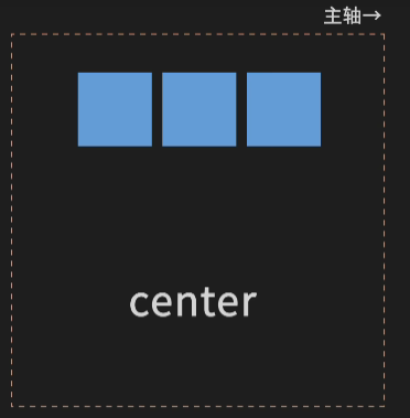
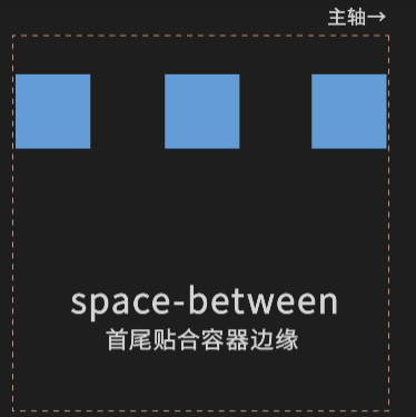
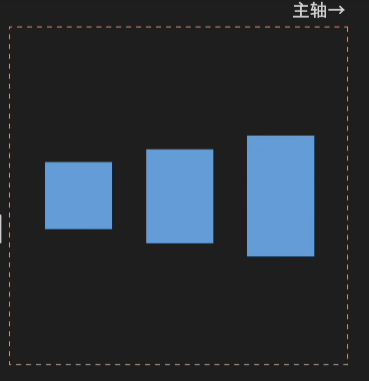
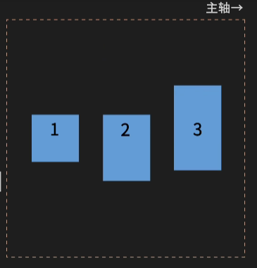
2.定义子元素在x横轴方向的对齐方式:justify-content
flex-start(默认 主轴前对齐)
flex-end(后对齐)
center(居中)
space-between(等距 首位)
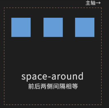
space-around(等距 两边)
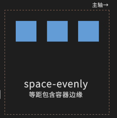
space-evenly(等距 容器)
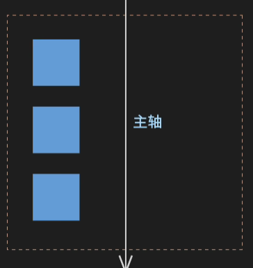
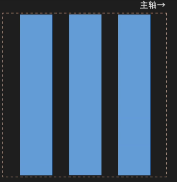
3.定义子元素在y纵轴的对齐方式:align-items
flex-start(默认 纵轴前对齐)
flex-end(纵轴后对齐)
center(居中)
baseline(文字基线)
stretch(拉伸)
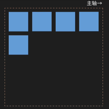
4.超出容器轴线长度自动换行:flex-wrap
wrap(换行)
nowrap(默认 不换行)
wrap-reverse(行序反向)
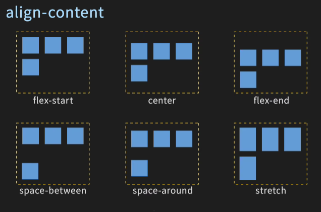
5.定义了多行项目在纵轴的对齐方式:align-content
- flex-start
- flex-end
- center
- stretch
- space-between
- space-around
transform
translate实现偏移效果
transform: translate(x,y); 实现偏移效果 x和y是参照自身的位移量,可以是百分比
rotate实现旋转效果
transform: rotate(30deg); 实现旋转效果 正数表示顺时针旋转,负数表示逆时针旋转
rotate默认是以元素的中心作为圆点进行旋转
可以通过transform-origin属性对圆点进行修改
transform-origin: top left; 以元素左上角作为旋转圆点
scale实现缩放效果
transform: scale(0.5, 0.8) 0.5表示宽 0.8表示高,只填一个就是宽高一致缩放
缩放也可以通过transform-origin修改缩放的奇点
transform-origin: top left; 以元素左上角作为缩放奇点
skew实现倾斜效果
transform: skew(30deg, 10deg); 30deg表示水平方向倾斜角度 10deg垂直方向倾斜角度,传一个就一致倾斜
倾斜也可以通过transform-origin修改倾斜的奇点
transform-origin: top left; 以元素左上角作为倾斜的奇点
matrix实现2D变换矩阵的方式
transform: matrix(a, b, c, d, e, f)
a 和 d 控制元素的缩放
b 和 c 控制元素的倾斜或斜切
e 和 f 控制元素的平移
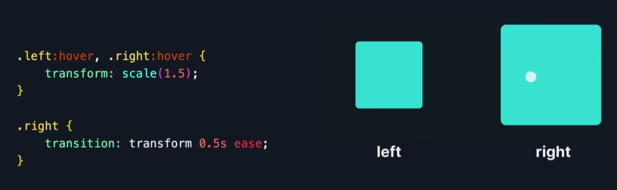
transition实现过渡效果
transition: property duration timing-function delay;
property:需要过度的属性
duration:过渡的时长
timing-function:缓动函数
delay:开始延迟时间
例如:
垂直居中
文本: line-height = height 图片: vertical-align: middle; absolute 定位: top: 50%; left: 50%; transform: translate(-50%, -50%); flex: display:flex; margin:auto
子选择器 >
子选择器只作用父元素下面的第一级标签
xxxxxxxxxx<style> body>p{ background-color: greenyellow; }</style><body> <p>p1</p> <p>p2</p> <p>p3</p> <ul> <li> <p>p4</p> </li> <li> <p>p5</p> </li> <li> <p>p6</p> </li> </ul></body>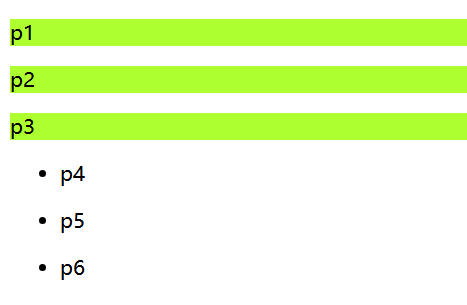
相邻兄弟选择器 +
只作用于相邻的标签的下个标签
.active必须是和要找的标签一样,例如下面都是p标签
xxxxxxxxxx<style> .active+p{ background-color: yellowgreen; }</style><body> <p>p1</p> <p class="active">p2</p> <p>p3</p> <ul> <li> <p>p4</p> </li> <li> <p>p5</p> </li> <li> <p>p6</p> </li> </ul> <p>p7</p> <p class="active">p8</p> <p>p9</p></body>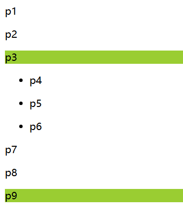
通用兄弟选择器 ~
当前选择的标签向下所有的同级相同类型的标签
xxxxxxxxxx<style> .active~p{ background-color: yellowgreen; }</style><body> <p>p1</p> <p class="active">p2</p> <p>p3</p> <ul> <li> <p>p4</p> </li> <li> <p>p5</p> </li> <li> <p>p6</p> </li> </ul> <p>p7</p> <p>p8</p> <p>p9</p></body>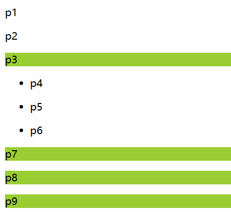
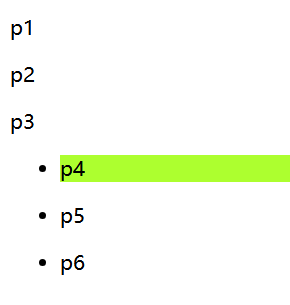
:first-child选择第一个元素
xxxxxxxxxx<style> ul li:first-child{ background-color: greenyellow; }</style><body> <p>p1</p> <p>p2</p> <p>p3</p> <ul> <li> <p>p4</p> </li> <li> <p>p5</p> </li> <li> <p>p6</p> </li> </ul></body>
:last-cild选择最后一个元素
xxxxxxxxxx<style> ul li:last-child{ background-color: greenyellow; }</style><body> <p>p1</p> <p>p2</p> <p>p3</p> <ul> <li> <p>p4</p> </li> <li> <p>p5</p> </li> <li> <p>p6</p> </li> </ul></body>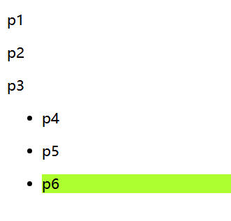
p:nth-child(2)
选择当前p元素的父级元素,选中父级元素的第一个,并且是当前指定的元素才生效
xxxxxxxxxx<style> li:nth-child(2){ background-color: greenyellow; }</style><body> <p>p1</p> <p>p2</p> <p>p3</p> <ul> <p>111</p> <li> <p>p4</p> </li> <li> <p>p5</p> </li> <li> <p>p6</p> </li> </ul></body>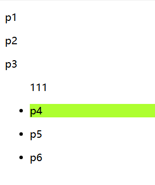
p:nth-of-type(2)
选择父元素里第2个类型为p的元素
xxxxxxxxxx<style> p:nth-of-type(2){ background-color: yellowgreen; }</style><body> <p>p1</p> <p>p2</p> <p>p3</p> <ul> <li> <p>p4</p> </li> <li> <p>p5</p> </li> <li> <p>p6</p> </li> </ul></body>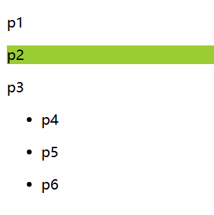
:hover鼠标移过去的样式
xxxxxxxxxx<style> .active:hover{ background-color: yellowgreen; }</style><body> <p class="active">p1</p> <p>p2</p> <p>p3</p> <ul> <li> <p>p4</p> </li> <li> <p>p5</p> </li> <li> <p>p6</p> </li> </ul></body>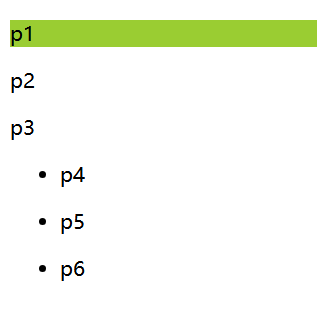
属性选择器(常用)
xxxxxxxxxx<body> <a href="http://www.baidu.com" class="links item first" id="first">1</a> <a href="" class="links item active" title="test" target="_blank">2</a> <a href="images/123.html" class="links item">3</a> <a href="images/123.png" class="links item">4</a> <a href="images/123.jpg" class="links item">5</a> <a href="abc" class="links item">6</a> <a href="/a.pdf" class="links item">7</a> <a href="/abc.pdf" class="links item">8</a> <a href="abc.doc" class="links item">9</a> <a href="abcd.doc" class="links item last" id="last">10</a></body>xxxxxxxxxxa{ display: block; /*以块级显示 要不然类似a span标签不支持设置宽高 设置后就类似div一样占一行*/ float: left; /*向左浮动*/ width: 50px; height: 50px; background-color: blue; color: white; font: bold 20px/50px arial; /*bold是加粗 20px是字体大小/50px是行高 arial是字体样式*/ text-decoration: none; text-align: center; margin-left: 5px; border-radius: 5px;}给有id属性的设置样式
xxxxxxxxxxa[id]:hover{ background-color: greenyellow;}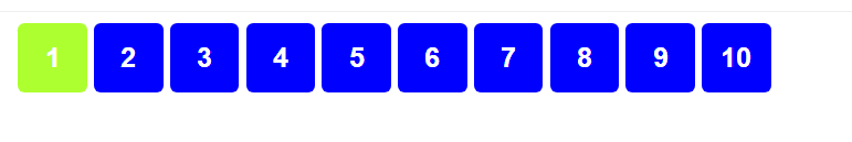
给id等于last的设置属性
这里不需要加引号,因为id是唯一的
xxxxxxxxxxa[id=last]{ color: red;}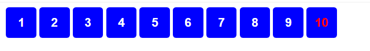
给class等于links item first的设置样式
xxxxxxxxxxa[class="links item first"]{ background-color: wheat;}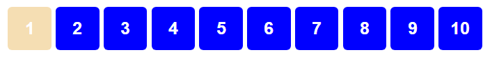
给所有class里包含links的设置样式
xxxxxxxxxxa[class*="links"]{ color: red;}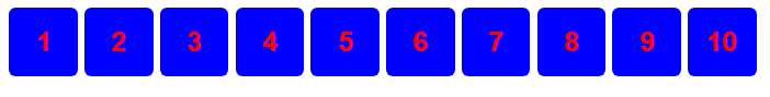
给href中以http开头的设置样式
xxxxxxxxxxa[href^="http"]{ background-color: greenyellow;}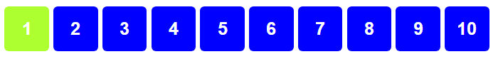
给href中以pdf结尾的设置样式
xxxxxxxxxxa[href$="pdf"]{ background-color: greenyellow;}
字体样式
font-family: 楷体 设置字体样式
font-size:50px 设置字体大小
font-weight: bold 设置粗细
color 字体颜色
font: bold 20px/50px 楷体 便捷设置字体
文本样式
color:red; 颜色
text-algin: center/left/right; 文本居中/偏左/偏右
text-indent:2em 首行缩进2个字符
text-shadow: 5px 5px 5px #FF0000; 设置阴影
line-height:50px; 设置行高,一般高度是多少就设置多少
text-decoration: underline/line-through/overline 下划线/中划线/上划线
水平对齐:
xxxxxxxxxx<style> /*让两个元素水平对齐,因此需要写两个元素作为参照*/ img,span{ vertical-align: middle; }</style><body> <div class="container"> <img src="img/a.png"/> <span>hello world</span> </div></body>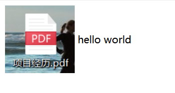
a超链接伪类
a:hover 是鼠标放上悬停时的效果
a:active 是点击时不松手的效果
a:link 是未访问时的效果
a:visited 是访问完后的效果
.box:before 可以在元素内容的前面插入新内容,必须要有content属性,如果不需要就写为空content=""
.box:after 可以在元素内容的后面插入新内容,必须要有content属性,如果不需要就写为空content=""
鼠标指针样式
cursor: point; 鼠标变成手
列表样式
list-style: none/circle/decimal/square; 设置列表前的小点,去掉/空心圆/有序列表/正方形
如果设置了margin: 0px; padding: 0px; 则列表样式会被遮蔽住,只有设置margin-left才能看到
背景图片
background-image: url("imgs/a.png") 默认全部平铺
background-repeat: repeat-x; 水平平铺
background-repeat: repeat-y; 垂直平铺
background-repeat: no-repeat; 不平铺
background-position: 50px 20px; 背景位置 x轴/ y轴
background: red url("imgs/a.png") 50px 20px no-repeat; 颜色/ 图片/ x轴/ y轴/ 不平铺
盒子模型
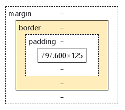
margin 外边距
border: 1px solid red 边框 solid实线 dashed虚线
padding 内边距
box-shadow: 10px 10px 100px yellow; 盒子阴影
盒子模型的尺寸:border + margin + padding + 内容元素
使用margin进行水平居中
前提:父元素有宽度,需要居中的元素是块元素且设置宽度,在需要居中的元素里使用 margin: 0 auto; 进行水平居中
使用text-align进行水平居中
前提:父元素有宽度,需要居中的元素是块元素且设置宽度,在需要居中的元素里使用 text-align:center; 进行水平居中
浮动
块级元素:独占一行
xxxxxxxxxxh1~h6 p div 列表 等行内元素:不独占一行
xxxxxxxxxxspan a img strong 等display: block; 设置成块元素
display: inline; 设置成行内元素
display: inline-block; 设置成既是块元素又是行内元素
display: none; 隐藏,但是源码里还是有
如果给一个元素即设置了float:left; 又设置了clear: both; 这样的话会浮动然后变成块元素独占一行的浮动
clear: left/both/right; 分别是左侧/全部/右侧不允许有浮动,如果有那就排到对应位置的后面去
overflow
overflow: hidden; 将浮动后溢出的部分(即超过父元素高度的部分)进行隐藏
overflow: scroll; 给父元素增加滚动条,将浮动后溢出的部分显示在滚动条里
overflow-x: hidden; 取消x轴的滚动条 overflow-y: hidden; 取消y轴的滚动条
当x轴和y轴的滚动条同时取消的时候就相当于设置overflow: hidden;
解决浮动后父级边框塌陷问题
解决方法:方法2和4是最认可,最常用的还是方法4
1.增加父级元素高度
2.在所有浮动元素的最后增加空的div 给div设置属性 clear: both; margin: 0; padding: 0;
3.在父元素没有设置高度的情况下使用overflow: hidden; 如果父元素设置了高度,子元素部分内容就会被隐藏掉
4.父元素无需高度,在父元素的css中添加一个伪类 :after 原理和方法2类似,可以避免在html中增加空div
xxxxxxxxxx.container:after{ content:''; display: block; clear: both;}具体示例:
x<style> *{ padding: 0; margin: 0; } .container{ width: 1000px; border: 1px solid greenyellow; margin-left: 100px; /*1.给父元素设置合适高度*/ /*height: 680px;*/
/*3.使用overflow*/ /*3.1 使用overflow:hidden*/ /*overflow: hidden;*/ /*3.2使用overflow:scroll*/ /*height: 200px; overflow: scroll;*/ } /*4.给父元素增加一个伪类:after*/ .container:after{ content: ''; clear: both; display: block; }
img[src$="a.jpg"]{ float: left; clear: both; } img[src$="b.jpg"]{ width: 150px; height: 300px; float: left; clear: both; } img[src$="c.jpg"]{ float: right; clear: both; } span{ float: right; clear: both; }</style><body> <div class="container"> <img src="img/a.jpg"> <span>我要学习,我爱学习,努力学习</span> <img src="img/b.jpg"/> <img src="img/c.jpg"/> <!--2.在父元素底部增加一个空div--> <!--<div class="clear" style="clear: both; margin: 0; padding: 0;"></div>--> </div></body>
行内元素排列的方式
1.使用display: inline-block;
2.使用float: left; clear:both;
二者对比:
display: 方向不可以控制
float: 浮动起来会脱离标准文档流,要解决父级边框塌陷的问题
定位position
相对定位relative
相对自己原来的位置进行指定的偏移,仍然在标准文档流中所以不会造成父级边框塌陷的问题,其原来的位置依然被保留下来了
xxxxxxxxxx<style> body{ padding: 20px; } div{ margin: 20px; } .container{ border: 1px solid greenyellow; margin-left: 10px; } .first{ border: 1px dashed #067CEA; background-color: #067C99; /*相对定位*/ position: relative; left: 50px; bottom: 50px; } .second{ border: 1px dashed #E74C3C; background-color: #E74C99; } .third{ border: 1px dashed #64CE83; background-color: #64CE99; }</style><body> <div class="container"> <div class="first"> 第一个盒子 </div> <div class="second"> 第二个盒子 </div> <div class="third"> 第三个盒子 </div> </div></body>绝对定位absolute
1.没有给父元素设置定位,则绝对定位的元素会相对于浏览器进行定位
2.父元素有relative相对定位,则绝对定位的元素会相对于父元素进行定位
3.在父级元素范围内进行移动
相对于父级或浏览器进行定位偏移,不在标准文档流当中,原来的位置不会被保留
xxxxxxxxxx<style> *{ padding: 0; margin: 0; } div{ margin: 20px; } .container{ border: 1px solid greenyellow; margin-left: 10px; /*绝对定位给父元素一个定位*/ position: relative; } .first{ border: 1px dashed #067CEA; background-color: #067C99; } .second{ border: 1px dashed #E74C3C; background-color: #E74C99; /*绝对定位*/ position: absolute; left: 10px; } .third{ border: 1px dashed #64CE83; background-color: #64CE99; }</style><body> <div class="container"> <div class="first"> 第一个盒子 </div> <div class="second"> 第二个盒子 </div> <div class="third"> 第三个盒子 </div> </div></body>固定定位 fixed
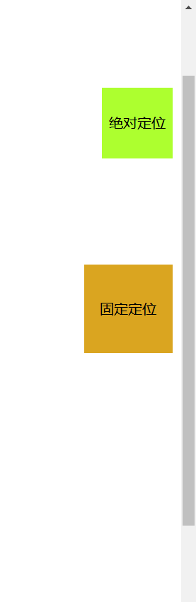
定位在一个地方不变
xxxxxxxxxx<style type="text/css"> *{ padding: 0; margin: 0; } body{ height: 1000px; } div:nth-of-type(1){ width: 80px; height: 80px; line-height: 80px; text-align: center; background-color: greenyellow; /*绝对定位*/ position: absolute; right: 10px; top: 200px; } div:nth-of-type(2){ width: 100px; height: 100px; line-height: 100px; text-align: center; background-color: goldenrod; /*固定定位*/ position: fixed; right: 10px; top: 300px; }</style><body> <div class="box1">绝对定位</div> <div class="box2">固定定位</div></body>
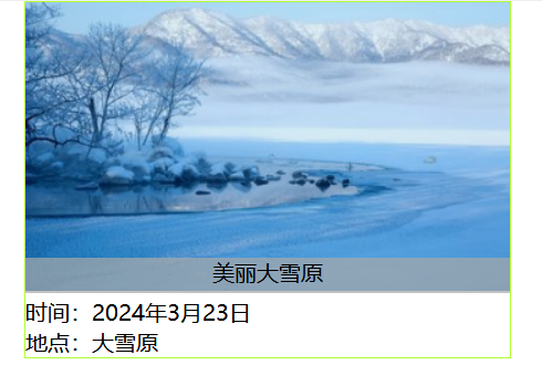
z-index
xxxxxxxxxx<style> *{ padding: 0; margin: 0; } .container{ margin: 0 auto; width: 350px; border: 1px solid greenyellow; } .container ul{ /*给父元素一个相对定位*/ position: relative; } .container ul li{ list-style: none; } .tipText,.tipBg{ /*子元素绝对定位*/ position: absolute; top: 185px; width: 100%; } .tipText{ text-align: center; z-index: 999; } .tipBg{ height: 25px; background-color: darkgray; /*设置透明度*/ opacity: 0.7; }</style><body> <div class="container"> <ul> <li><img src="img/d.jpg"/></li> <li class="tipText">美丽大雪原</li> <li class="tipBg"></li> <li>时间:2024年3月23日</li> <li>地点:大雪原</li> </ul> </div></body>